As an SME or startup manager, you know that your brand is your most valuable asset. It reflects your identity, your values and your customer promise. Did you know that typography, much more than a simple aesthetic choice, plays a crucial role in the way your brand is perceived? Choosing the right typography means mastering a powerful communication tool. In this article, Comhit guides you to understand the impact of typography and how to use it effectively to reinforce your brand image. We give you concrete, actionable advice on how to make typography a major asset in your branding strategy.
Select a typeface that matches your identity
The choice of typography should reflect the essence of your brand. Is it modern and bold, or classic and timeless? Each typeface has its own personality and evokes specific emotions. For example, a sans-serif font (such as Helvetica or Open Sans) may convey an image of modernity and simplicity, while a serif font (such as Times New Roman or Garamond) suggests tradition and reliability.
Key tip: Define your positioning and values before choosing your typeface. If your brand is focused on innovation, opt for sleek, contemporary fonts. For a more traditional company, opt for more classic, sophisticated fonts.
Create a clear and effective visual hierarchy
Typography is essential for organizing information and guiding the reader's eye. Use different sizes, weights and font styles to create a clear visual hierarchy. This helps to structure your content, highlight important elements and make it easier to read.
- Main title : Use a bigger, bolder font to attract attention.
- Secondary titles : Use a slightly smaller size and weight to organize your subsections.
- Body text : Opt for a legible font size and sufficient line spacing for reading comfort.
Master the emotional impact of fonts
Beyond their functional aspect, typefaces have a strong emotional impact. Some fonts evoke confidence, others creativity, joy or seriousness. Take the time to analyze the emotions you wish to evoke in your audience and choose the fonts that best match them.
Common mistake: Use too many different fonts. This can detract from visual coherence and confuse the message. Limit yourself to a maximum of two or three fonts (one for headings, one for body text, and possibly one for accent elements).
Ensure legibility on all media
Your typography must be legible on all media: website, applications, printed documents, etc. Check the legibility of your fonts at different sizes and in different contexts. Also test line spacing, line length and color contrast to optimize the user experience.
For web design, make sure your fonts are compatible with different browsers and devices (computers, tablets, smartphones). Think responsive design for optimal adaptation.
Avoid common mistakes
Some typographical errors can damage your brand image.
- Poor contrast : Avoid color combinations that make text difficult to read.
- Justified text : Avoid full justification of text blocks, especially on the web, as this can create white «rivers» that impair legibility.
- Abuse of capital letters : Use capital letters sparingly, as they can make the text less pleasant to read.
- Fancy fonts: Avoid decorative fonts that may distract the reader.
In short, typography is an essential element of your branding. For a strong, impactful visual identity, choose fonts adapted to your brand, create a clear hierarchy, master emotional impact and ensure legibility on all media.
Key takeaways:
- Define your brand values before choosing the typeface.
- Create a clear visual hierarchy to structure information.
- Test the legibility of your typography on all media.
Need help optimizing your visual identity? Comhit helps Parisian SMEs and startups create and enhance their brand. Contact us for a personalized consultation.
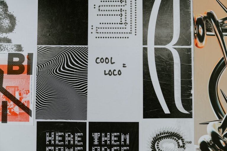
Image by: Brett Jordan
https://unsplash.com/@brett_jordan