Your visual identity is your customers' first impression of your company. A clumsy choice of typography can damage your credibility and appeal. In today's competitive environment, a strong, consistent visual identity is essential to stand out from the crowd, earn trust and create a lasting relationship with your audience. This article provides a step-by-step guide to optimizing your image by making the right typographic choices, from the most pragmatic to the most strategic. Discover how the right typography can boost your brand and capture your target's attention in today's saturated visual universe.
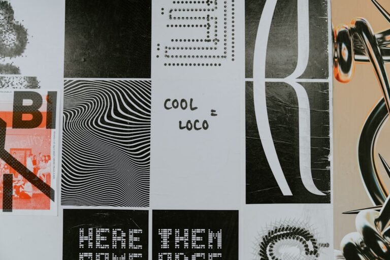
Choose a typeface that reflects your identity
Appropriate typography is a crucial element in communicating your brand image. It must reflect your personality, your industry and your target audience. Imagine a luxury company using a typography that's too simple, or a technology start-up opting for a font that's too classic. These examples illustrate the importance of strategic choice.
Key tip: Before making any choices, clearly define your brand's values and personality. In-depth research and analysis of the typefaces used by your competitors will provide you with inspiring ideas.
Adapt your typography to your communication media
Your website, your business cards, your printed communication materials: each medium must use a consistent typography. Appropriate adaptation is essential. A font that's legible on a screen won't necessarily be optimal on a flyer. A pragmatic approach is required for each medium.
- Determine the use of each font on each medium.
- Test readability on different media and formats.
- Make sure displays are easy to read and adapt to your needs.
Focus on clarity and legibility
Legible typography is essential for effective communication. Poor legibility can lead to loss of interest and misunderstanding of your message. Study proportions, spacing between characters (lettering) and lines (line spacing).
Common mistake: Use too many different fonts or complex styles that make the message difficult to read. Here's a solution: choose a combination of 2 to 3 maximum, clearly differentiated fonts.
Consider trends, but keep your identity
It's a good idea to observe current typographic trends. But don't forget to adapt them to your own style. Innovation must be built on a solid foundation to integrate naturally with your brand and avoid weakening it. You need to maintain visual consistency.
Key tip: A typography that evolves with finesse and subtlety is more effective than a simple copy of a trend. A consistent, recognizable visual identity is the key to a brand's appeal.
Enhance your brand image through design
A judicious choice of typography creates a strong, coherent visual identity. A well thought-out design is essential to the success of your message.
In conclusion, a well-considered choice of typography is a key element in strengthening the brand image of your SME/startup. By following these practical tips, you can optimize your visual communication, improve your brand awareness and create a stronger connection with your target audience. Don't hesitate to experiment, test and adjust your typographic choices according to the feedback you receive. For an in-depth analysis of your visual identity and the creation of a customized typographic strategy, contact Comhit, your branding and design agency in Paris.
- Identify your brand's core values.
- Choose a typeface that reflects your identity.
- Ensure legibility and consistency across all media.
- Rely on a clear, recognizable visual identity.
Contact us for a free analysis of your visual identity.
Image by: OSAMA MOHAMED
https://www.pexels.com/@osama-mohamed-2155324297