Your company's image is your number one selling point. And did you know that the choice of typeface plays a crucial role in how your audience perceives your brand? In a saturated market, where attention is a scarce commodity, well thought-out typography can make all the difference. It reinforces your message, enhances the user experience and subtly communicates your company's values. This article offers practical advice on how to optimize your image through controlled typography, for strong visual impact and effective communication.
Choose fonts that reflect your identity
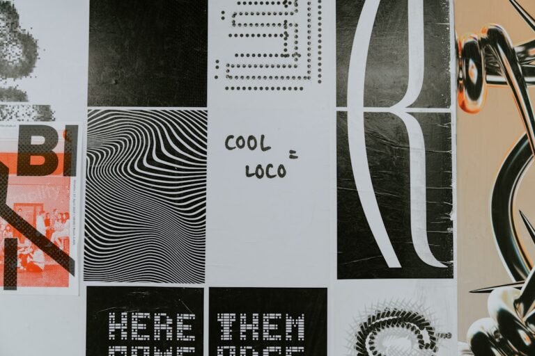
Typography isn't just a question of aesthetics, it's a visual language. Each typeface conveys its own personality: elegance, modernity, seriousness, accessibility... So it's essential to choose fonts that match your brand's identity and the message you want to convey.
Advice : Define a mood board for your brand. Gather images, colors and keywords that describe your identity. Use it as a guide to select fonts that match this overall mood.
Ensure legibility above all else
Beautiful typography is useless without legibility. Legibility is paramount, especially for digital media where attention spans are limited. Avoid fonts that are too thin, complex serifs or sizes that are too small. Keep in mind that your audience needs to understand your message quickly and easily.
- Select fonts adapted to different uses (titles, body text, captions).
- Test your fonts on various media (website, brochures, social networks).
- Choose sufficient contrast between text and background.
Master font combinations for harmonious design
Combining fonts is an art. Using multiple fonts can enrich your design, but it must be done sparingly and consistently. The aim is to create a visual balance and reinforce your message, without overloading your communication.
A few basic rules:
- Contrast : Combine a strong title font with a more discreet body font.
- Consistency : Choose fonts that share common characteristics (same family, same style).
- Avoid combinations that are too similar or too different.
Common mistake: Use too many different fonts. This hampers legibility and gives the impression of clutter.
Optimize user experience on the web
Web design offers numerous possibilities for enhancing your typography. Adapt your typography to the digital environment for an optimal user experience. This means choosing web-friendly fonts, optimizing size and line spacing, and taking responsive design into account.
| Element | Advice |
|---|---|
| Web fonts | Use web-optimized fonts (Google Fonts, Adobe Fonts) for better performance and compatibility. |
| Size and line spacing | Adjust text size and line spacing for comfortable legibility on all screens. |
| Responsive design | Make sure your typography adapts to all media (computers, tablets, smartphones). |
In short, well thought-out typography is a major asset for your company. It reinforces your identity, improves legibility and optimizes the user experience. By following these tips, you can create a strong, memorable brand image.
To find out more :
- Define your brand mood board.
- Choose legible fonts adapted to your audience.
- Test your fonts on different media.
- Match fonts carefully.
- Optimize your typography for the web.
Need help defining your visual identity and choosing the perfect typography? Contact Comhit. Our branding and design experts are at your disposal to help you create a strong, impactful brand image.
Image by: Anthony Persegol
https://unsplash.com/@moanarchives