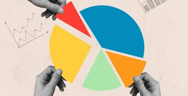
In a world where data is accumulating at lightning speed, what is data if it can't be exploited? Data visualization is a clear, visual answer to this challenge. It transforms raw figures into graphical representations that are easy to understand, share and exploit.
Why use data visualization?
Data visualization simplifies analysis. It enables you to analyze data quickly, detect trends and derive actionable insights. Whether you're an SME, an analyst or a marketing manager, these visualizations help you make more informed decisions.
Key benefits :
- Speeds up the reading and interpretation of structured data.
- Enables clear communication, even with a non-technical audience.
- Facilitates the distribution of complex data in visual form.
- Stimulates data exploration and strategic thinking.
Common examples of data visualization
Each type of data visualization has its own specificities. Here are a few of them, adapted to different analyses:
Graphs & charts
Bar charts : to compare several categories.
Scatterplots : to visualize correlations between two variables.
Mustache boxes : to study data distribution and detect outliers.

Maps & geolocation
Heat or interactive maps: useful for geographic data, to visualize areas of activity or performance.

Interactive visualizations
These tools offer in-depth exploration, particularly relevant for real-time data analysis.

Which data sources should be visualized?
Data sources vary according to the tools used and the objectives. Here are the most common:
- Relational databases : like MySQL or PostgreSQL, they provide easy-to-use structured data.
- Real-time APIs : useful for displaying real-time data (e.g. weather, traffic, social events).
- Flat files (CSV, logs) : for a simple first visualization.
- Geographical data : essential for spatial visualization (zones, regions, territories).
Data visualization: a strategic tool for understanding
Data visualization is a strategic tool for analyzing data, making better decisions and sharing visually comprehensible insights. It gives meaning to data in real time, from a variety of structured, relational or geographic data sources.