Your logo is much more than just an image. It's the visual embodiment of your startup, the first contact with your potential customers, and a key element of your identity. A botched logo can damage your credibility, dilute your message, and cost you dearly in missed opportunities. In this article, we at Comhit reveal the 5 most common mistakes to absolutely avoid when creating your logo. Get ready to transform your approach and build a strong, memorable visual identity.
Define a clear identity from the outset
Many startups launch without a clear vision of their brand. The result: generic, soulless logos that struggle to stand out. The logo should reflect your company's values, mission and personality. Think about the story you want to tell.
Advice : Before you start designing, draw up a brief including your positioning, your targets, your brand promise, and the keywords that define you. This document will serve as a valuable guide.
Don't be swayed by passing trends
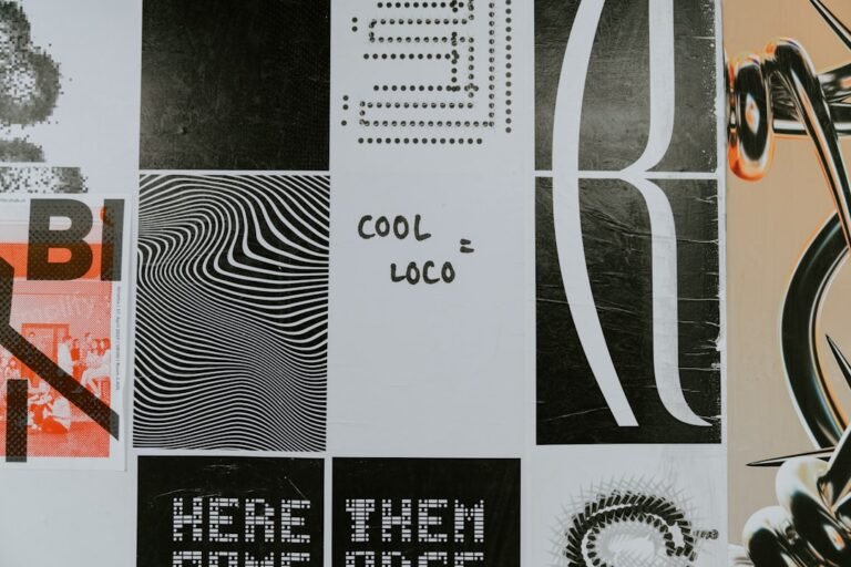
Design trends change fast. A «trendy» logo today may be out of fashion tomorrow. Opt for a timeless design that stands the test of time. Think long-term.
Error: Blindly following trends (gradients, complex typography, etc.) can quickly age your logo. A simple, effective logo is often the most memorable.
Choose the right typeface for your brand
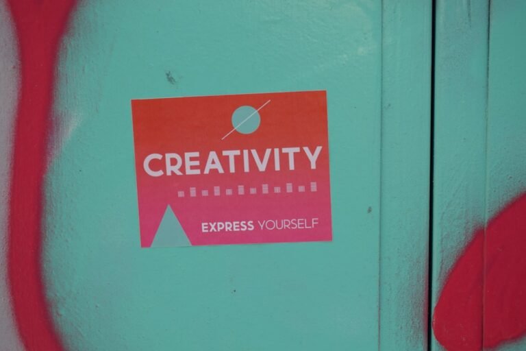
Typography is a crucial element. It conveys an atmosphere, an emotion. The choice of typeface must be in keeping with the image you wish to project. A font that's too whimsical can detract from legibility, while one that's too classic can seem impersonal.
- Search for : Explore different fonts (serif, sans-serif, script...) and see how they communicate.
- Test : Visualize your logo with several options to see which one fits best with your identity.
- Ensure legibility: The logo must be clearly legible, whatever its size or medium (website, business cards, etc.).
Ensure the versatility of your logo
Your logo will be used on a multitude of media: website, social networks, printed documents, etc. It must be adaptable to all these contexts. It must be adaptable to all these contexts. A logo that is too complex or detailed will be difficult to reproduce faithfully on a small scale or in black and white.
Advice : Create several versions of your logo: a main version, a simplified version and a monochrome version. This optimizes its use in a variety of situations.
Don't neglect professional feedback
Your friends and family can give you advice, but a branding expert can provide a crucial perspective. Professional designers understand the subtleties of design and can help you avoid the pitfalls. Investing in professional design is a worthwhile investment.
- Time-saving : A professional will save you time and avoid costly mistakes.
- Expertise: He masters the technical and creative aspects of logo design.
- Relevance : He designs a logo that matches your audience and your market.
In short, a successful logo is simple, memorable and representative of your brand. Avoid these 5 mistakes to ensure you create a visual identity that sets you apart. Need help with your branding? At Comhit, we turn ideas into impactful visual identities. Contact us to discuss your project and bring your brand to life.
Image by: Nandha Kumar
https://unsplash.com/@nandhu