Your visual identity is much more than just a logo: it's the first impression you make. Typography, often overlooked, is a crucial element of this identity. It conveys your company's values, influences brand perception and reinforces brand recognition. In a competitive Parisian market, mastering typography is a strategic advantage. This article offers concrete, actionable advice on how to optimize your choice of typography, create a strong visual identity and stand out from the crowd.
Choose typefaces aligned with your values
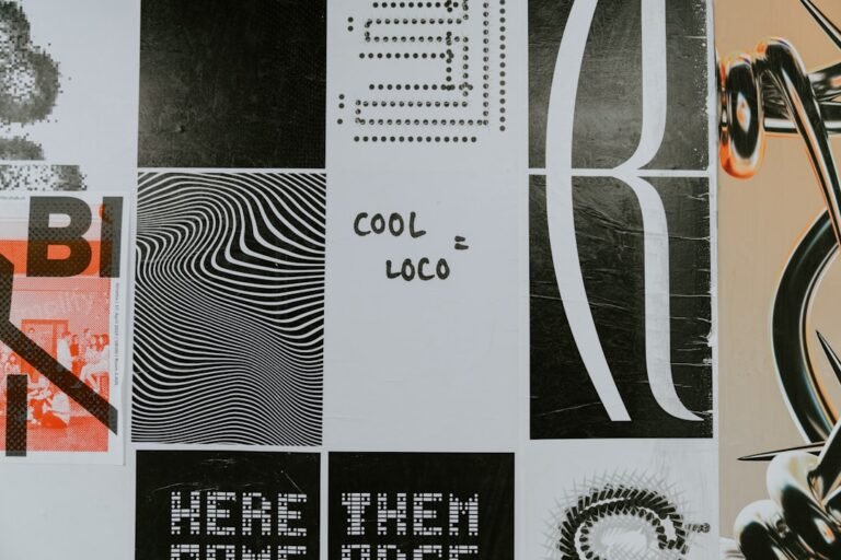
Typography is a silent language that communicates the essence of your brand. An elegant typeface for a luxury brand, a modern font for a technology startup, or a handwritten typeface for a craftsman: the choice must be intentional and thoughtful. It's imperative that your typography accurately reflects your values and positioning.
Key tip: Clearly define your brand personality. Use adjectives to describe it (modern, classic, bold, etc.). Then select typefaces that embody these traits.
Define a clear visual hierarchy to guide your readers
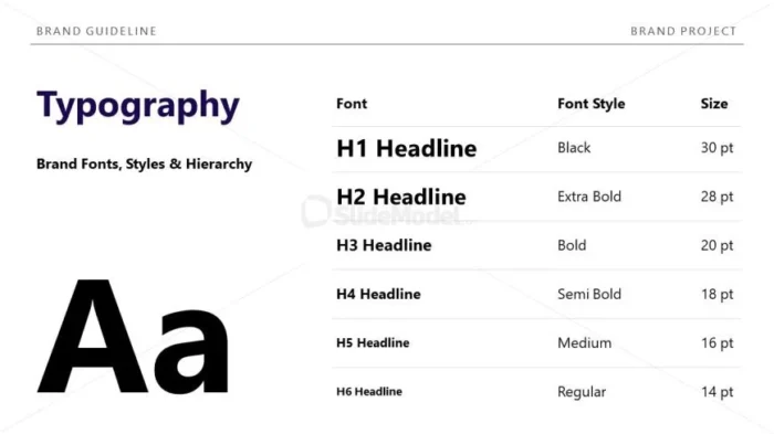
Good typography isn't just about choosing the right font. It's also about organizing information in a clear, hierarchical way. This facilitates reading, highlights important elements and enhances the user experience, which is crucial in a dynamic web environment.
- Titles : Use distinct, larger typography to attract attention.
- Subtitles : Provide a visual transition between headings and body text.
- Body text : Choose a legible, eye-pleasing font for long paragraphs.
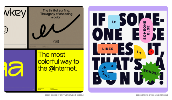
Create a consistent typographic palette for your brand

Don't settle for just one font! Define a typographic palette (a combination of fonts) that works well together. This creates a strong, recognizable visual identity. Think about the harmony between fonts: contrasts, complementarity... A well thought-out palette is a guarantee of professionalism.
Common mistake: Use too many different fonts. This creates confusion and dilutes your brand's impact. Limit yourself to two or three fonts maximum.
Test and adapt your typographic choices to all your media
Your visual identity needs to be consistent across all media: website, social networks, printed materials, etc. Make sure your typography is legible on all screens and formats. Test your choices to check their impact, and adapt them if necessary.
| Support | Key points |
|---|---|
| Website | Legibility, responsive design, loading time |
| Social networking | Image format, mobile-friendliness, visual appeal |
| Printed documents | Resolution, spacing, contrast |
The importance of legibility for effective communication
Legibility is paramount. A hard-to-read font detracts from your message and can frustrate your customers. Choose fonts with clearly distinct characters, with good spacing between letters and lines. Keep in mind the specifics of each medium (screens, print) to ensure optimal legibility.
In conclusion, typography is an essential pillar of your visual identity. By choosing your fonts wisely, structuring your information, and ensuring the consistency of your communication, you build a strong, memorable brand. For personalized support in creating or redesigning your visual identity, please contact Comhit. We'll help you bring your brand to life.