This site uses cookies to improve your browsing experience and analyze our audience. By clicking on "Accept", you consent to the use of these cookies. You can set your preferences or refuse non-essential cookies.
B2B Brochures at Trade Shows: What Visitors Keep, What They Throw Away, and Why
Printed brochures haven’t disappeared from trade shows. Their role has simply changed. Understanding what makes a visitor decide to slip one into their bag—or leave it on the edge of the booth across the way—allows us to completely rethink their design. It’s not a question of budget. It’s a question of relevance in the field.
7s
Average attention span of a shopper in the aisle
+60%
Unclaimed brochures discarded within 48 hours after the trade show
1/3
Qualified leads are used to identify a sales opportunity
Infographic
The lifecycle of a trade show brochure — click on each step
🏛️
Avenue
Day 0 — booth
👜
In the bag
Day 0 — end of the day
🏨
Hotel room
Last night — first sorting
🖥️
Office
Day 2 — Final Sorting
📞
Pipeline
Days 2–7 — follow-up
In the alley: The visitor takes everything without sorting through it. This is the only stage where your brochure is guaranteed to be in their hands. The decision-making window lasts less than 7 seconds—just enough time to read the cover and decide whether it’s worth continuing.
🧠 What visitors decide in less than ten seconds
A trade show visitor collects promotional materials throughout the day. When they arrive in the aisles, they take everything. At lunch, they start sorting through them. In the evening at the hotel, or back at the office on Monday, they keep only what warrants further action.
Filtering isn’t based on the quality of your content. It’s based on whether the value is immediately apparent. Visitors don’t read through content carefully. They scan it. They’re looking for a clear signal: does this document address a problem they’re facing right now?
👁️Signal No. 1
Readable in 3 seconds
If visitors have to read to understand what you do, they won’t read it. The main message must be clear at a glance.
🎯Signal No. 2
Clear sector-specific relevance
A single keyword («B2B SaaS,» «Series A,» «regulatory compliance») is enough to turn a generic brochure into a useful document.
📌Signal No. 3
The result? No way
«Shorten the sales cycle by 30%» is retained. «Support your digital transformation» is not. The vocabulary used in the means section does not trigger any follow-up.
🔗Signal No. 4
An identifiable exit link
Any promotional material without a QR code or dedicated URL is a dead end. Visitors have nowhere to go after the trade show.
A sales manager returning from an event has between twenty and forty promotional materials in their bag. In the week that follows, they only look at three to five of them. Click on each criterion to see what determines which ones they choose.
Criterion 01
Immediate sector-specific relevance
Visitors tend to focus on content that explicitly addresses their industry, challenges, or operational context. A general-interest brochure is treated as just another catalog, even if the offering is relevant to them.
Example: «We help B2B SaaS companies in the Series A to Series C growth phase structure their sales pipeline.» Immediately connects you with the right contact.
Criterion 02
Information density in the right format
A double-sided A5 sheet with two clear messages beats out a 16-page catalog in the return package. Physical weight is a real factor. A compact, concise format linked to a QR code that provides more information survives the sorting process.
Rule: 4 to 8 pages maximum. Anything longer than that won’t be read on the go. More detailed information should be included on the dedicated landing page.
Criterion 03
The presence of a direct point of contact
The name of the sales representative you met at the booth, their direct line, and a scheduled follow-up date. These elements transform a generic printed piece into a tool for building business relationships. Without them, the brochure is just another anonymous item.
Practical experience: Leave a blank space on the last page so that the sales representative can write down their first name and the contact’s name at the time of delivery.
Criterion 04
A promise of results, not methods
Visitors tend to focus on what promises a measurable and identifiable outcome. The language used to describe the approach («support,» «transform,» «optimize») does not prompt any follow-up action after the trade show.
Before: «We support your digital transformation.» — After: «Our clients are reducing their sales cycle from 30 to 90 days.»
🗑️ What the trash can is made of
Four patterns consistently emerge in rejected materials. They have nothing to do with the quality of the proposal or the printing budget.
01
Systematically eliminated
Cover page with a generic slogan — «Excellence to fuel your growth.» Visitors can’t figure out what you do in less than three seconds.
02
Systematically eliminated
Larger than A4 size, heavy paper, spiral-bound or hardcover. The weight in the bag is an unconscious but constant factor in sorting.
03
Systematically eliminated
Layout without a visual hierarchy. If visitors have to read to understand what you do, they won’t read it.
04
Systematically eliminated
No QR codes, no specific URLs. A platform with no way out is a commercial dead end. The conversation ends with the trade show.
💡
Case study: A 24-page, glossy, full-color catalog is often the least-read item of the day. Its format reflects the effort that went into producing it, not its relevance to the reader.
✓ Brochure still available
✗ Brochure removed
Cover
Customer issue described + target sector shown
Impact Sorting
Visitors can tell within 3 seconds whether the topic is relevant to them. This is the first screening step.
Cover
Logo + general slogan: «Excellence at your service»
Impact Sorting
No sign of interest. The brochure goes into the «to look at later» pile—which will never be looked at.
Page 2
Quantifiable social proof + recognizable customer
Impact Sorting
Instant credibility. Visitors realize that others have already taken the plunge—and that it worked.
Page 2
Introduction to the Founding Team and Company History
Impact Sorting
The visitor isn't interested in who you are. They want to know if you can solve their problem.
Format
A5 or DL, 4–8 pages, 250 gsm matte
Impact Sorting
Fits in your pocket. Lightweight. Easy to place on a desk. Its compact size makes it the ultimate portable physical filter.
Format
A4 or larger, 16+ pages, hardcover or spiral-bound
Impact Sorting
Bulky, heavy, hard to store. Shoved to the bottom of the bag before it even reaches the office.
Exit link
QR code linking to a landing page dedicated to the trade show
Conversion rate
Keep the conversation going after the event. The visitor has a specific action to take—scan the QR code and access the resource.
Exit link
Headquarters address and main phone number
Conversion rate
A commercial dead end. No action taken. The brochure dies along with the trade show.
🏗️ The Anatomy of a Material That Survives Sorting
Effective B2B marketing materials for trade shows follow a specific structure. It’s not about aesthetics for aesthetics’ sake. The structure is designed to drive post-event conversions.
Area
Expected content
Common mistake
Cover
Customer challenge + target industry + promised result
Full-page company name and logo
Page 2
Immediate social proof (known client, figures, context)
About the team or our history
Inside pages
2 to 3 use cases formulated as solved problems
List of features or services
Last page
QR code linking to a dedicated landing page + direct contact information
Printing decisions have a direct impact on retention rates. These are not merely aesthetic details.
A5
A5 or DL size (⅓ A4)
Fits in an inside pocket, holds up well at the bottom of a bag, and sits easily on a desk. Its compact size makes it the ultimate survival filter.
250 g
250 gsm matte-coated paper
A premium feel without the extra weight. The satin finish doesn't hold up well over time and tends to stick to other items in the bag. The matte finish conveys a sense of quality without adding bulk.
4–8
4 to 8 pages maximum
Beyond that, people don’t read the document on the go. They go to the dedicated landing page for more details. The brochure is a teaser, not a full report.
✗
Spiral-bound and non-standard formats
Difficulty in storing, tearing, and signs of complexity. Avoid using on any materials intended to travel with the visitor.
✗
Hot lamination on the cover
Printing of a generic catalog. Spot UV coating on select areas produces a superior finish at a comparable cost.
Answer these 5 questions to assess the preservation potential of your current media.
Quick diagnosisQuestion 1 of 5
Does the cover of your brochure clearly state the customer problem you’re solving?
🔄 Brochure and field operations: an integrated approach
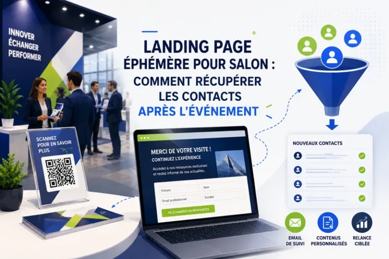
A brochure alone doesn’t drive conversions. It’s part of a structured campaign: booth design, sales team pitches, a QR code linking to a dedicated landing page, and a post-show follow-up sequence. Taken out of this context, it becomes just another document.
🔗
Required visual alignment: The brochure, the kakemono, the reception desk, and the landing page all share the same visual style. A stylistic disconnect between the booth and the printed materials suggests a lack of preparation. Visitors sense this, even if they can’t put it into words.
Exhibitors who achieve the highest post-event conversion rates treat their printed materials as part of a journey. Visitors who leave with a brochure should find an immediate connection between what they saw at the booth, what they’re holding in their hands, and what they discover when they scan the QR code.
Upcoming trade show
Is your brochure ready? Your booth too?
Brochure, booth design, dedicated landing page. We build the entire campaign, from print templates to the lead capture process.
Most agencies only handle print, web or heavy stand joinery. Comhit bridges the gap between the graphic design of your space and the sales performance of your teams in the field. We design signage that stops visitors in their tracks, and install digital tools to capture their contact details immediately.
How does the collaboration work?
We begin by analyzing the technical constraints provided by your show organizer (stand templates, dimensions, printing instructions). Together, we validate the information architecture before launching the graphic design process. Adjustments are made in real time, and we deliver certified files for your printers, as well as turnkey digital paths.
Do you offer after-sales support?
Absolutely. In addition to validating the technical conformity of your files directly with your printer or booth operator, we remain available by telephone for the duration of your show. And if you need on-site support for your QR codes or landing pages, our associate directors can provide rapid technical support.
Do you work with all types of companies?
We work exclusively for SMEs, ETIs and technology players in demanding B2B markets (industry, logistics, retail tech, services). We do not support consumer e-commerce or physical retail projects.
And if you're not satisfied with the first result?
Our step-by-step validation method eliminates any surprises. We validate concepts and message hierarchies before finalizing the complete design. We fine-tune the design until it's perfectly aligned with your conversion expectations and corporate image.
Join us!
Sign up to receive our design tips, news and exclusive resources for improving your visual communication.
Any questions?
Let's talk about your project. Quick briefing by phone or video to understand your needs.